Faster lines. Higher sales. Happier crowds.
Billfold is an RFID-powered payment ecosystem now used at large-scale festivals and stadiums worldwide.
I designed every touchpoint from scratch, from RFID wristband registration kiosks to vendor POS and guest-facing screens, to keep lines moving and payments effortless even when thousands of people ordered at once.
Overview
Billfold set out to solve one of the biggest frustrations in live events: slow, unreliable payments that created long lines and lost sales. Traditional card readers couldn't handle peak demand, transactions stalled, hardware failed, and both guests and vendors paid the price. Every minute in line was money not spent at the bar, merch booth, or food stand.
Overview
I designed a cashless payment ecosystem that cut those bottlenecks out of the experience. Using RFID wristbands, dual-screen POS devices, and rugged hardware built for crowds, we created a system that processed transactions in seconds, kept queues moving, and gave organizers real-time data across every vendor.
By removing payment bottlenecks, we achieved shorter waits, higher guest spending, and a smoother experience for everyone — from fans and staff to operators.

The Challenge
Designing for festivals and stadiums meant building a system that worked under extreme pressure. At peak times, thousands of guests ordered at once, and even a 2 second delay could ripple into minutes of waiting. Hardware had to survive weather, glare, and sticky hands, while staff with little training needed to serve quickly and without mistakes.
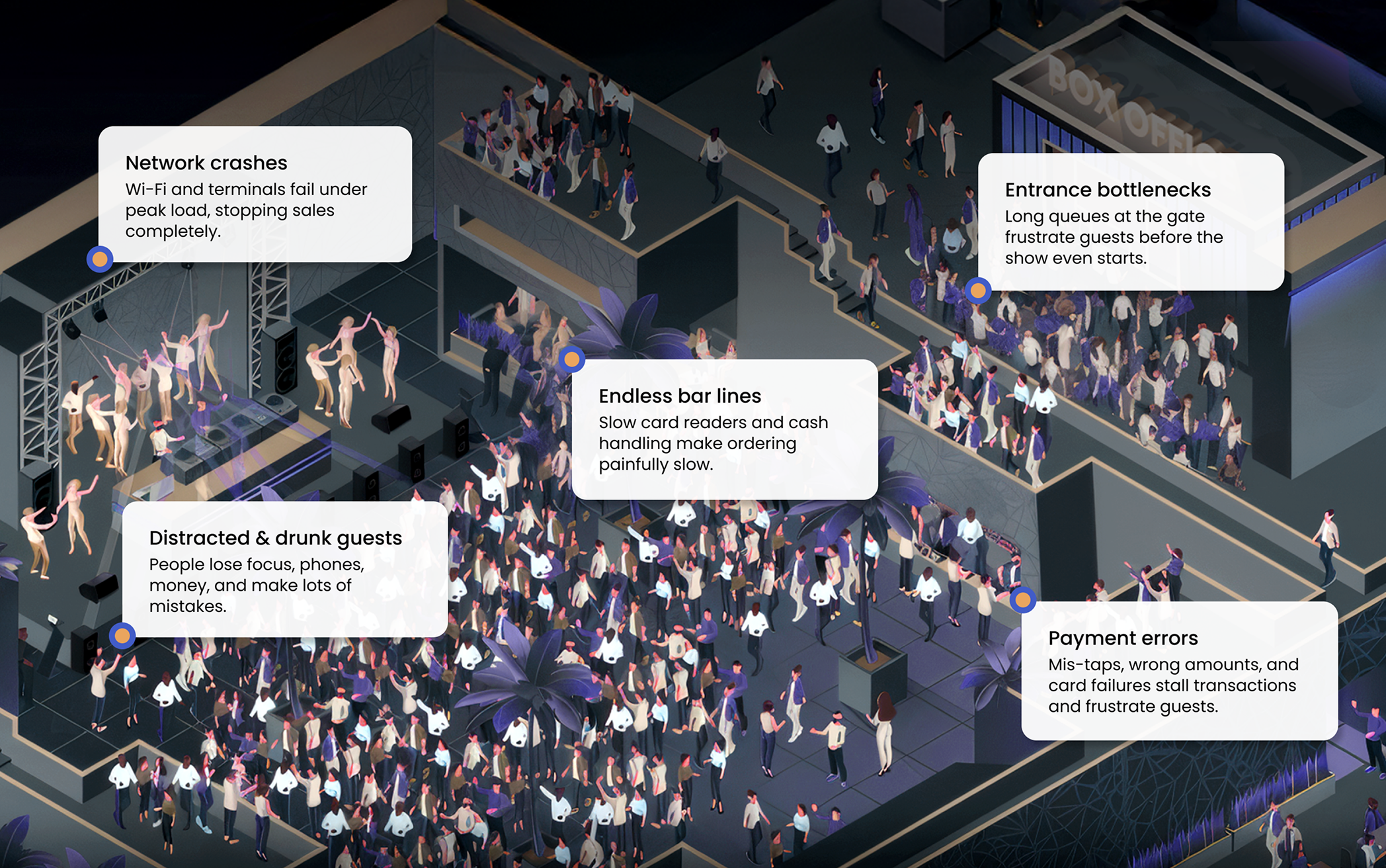
Guests were no easier: distracted, emotional, and often not fully sober, they gave only split-second attention to the screen. A single mis-tap could turn a $10 drink into a $100 charge, with no chance to explain mid-rush. Add failing networks, endless bar lines, and frustrated crowds, and every transaction carried the risk of slowing the whole event.
The challenge was clear: design a payment system that worked in chaos — fast enough to keep lines moving and reliable enough to protect revenue at every transaction.
My Part in This
I joined Billfold when there was no design team, no interface, and no real product — just a vision, a rough hardware prototype, and the urgency to move fast. From that starting point, my role was to transform a raw idea into something real, usable, and resilient enough for the chaos of live events.
For several years, I was the sole designer on the team, responsible for everything from early research and wireframes to polished prototypes and final UI. I created design systems, explored countless edge cases, and ensured consistency across hundreds of vendor- and guest-facing screens.
Based in Russia while events ran in the US, I couldn’t just pop into a festival, so I relied on user videos, staff feedback, and constant iteration with engineers on-site.
I owned the full design process: flows, wireframes, and production-ready prototypes for all interfaces.
Every decision accounted for sun glare, rushed taps, intoxicated users, unreliable hardware, and environments where nothing went to plan.
Worked closely with founders and engineers to stay aligned and adapt quickly between live events, no hand-off, no disappearing after delivery.
Research & Discovery
Since I couldn’t attend US festivals in person, research had to happen remotely. I worked closely with PMs, event staff, and engineers to understand how payments broke down during live events, and what vendors and guests struggled with the most. Feedback came from videos, on-site reports, and rapid loops between design and deployment.
This process helped me uncover the real conditions the product had to survive: sun glare on screens, beer-soaked hardware, distracted and impatient guests, and staff with minimal training. By combining remote insights with field feedback, I could translate messy realities into design principles the team could build on.
Reviewed staff videos and on-site recordings to see exactly where transactions stalled or failed during peak load, and what staff did (or didn't do) when things broke.
Collected structured input from PMs, event staff, and engineers after each deployment. Recurring pain points shaped the next iteration.
Broke down the highest-risk moments: bar rushes, entry bottlenecks, late-night surges, to find the failure patterns worth solving first.
Studied how sun, glare, noise, and wet hands shaped what users actually noticed on screen. Physical context wasn't a footnote — it drove decisions.
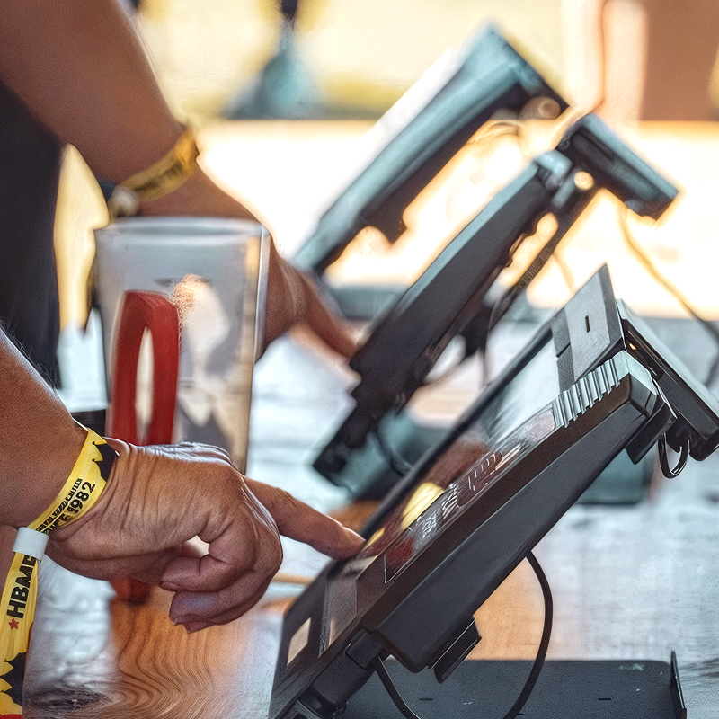
Transactions needed to complete in under two seconds to keep lines moving.
Distracted, emotional, or drunk, they missed instructions and made constant mistakes.
Temporary staff needed flows that were self-explanatory from the first tap.
Sun glare, spills, and poor connections constantly pushed the system to fail.
Every mis-tap or failed charge meant delays, complaints, and lost sales.

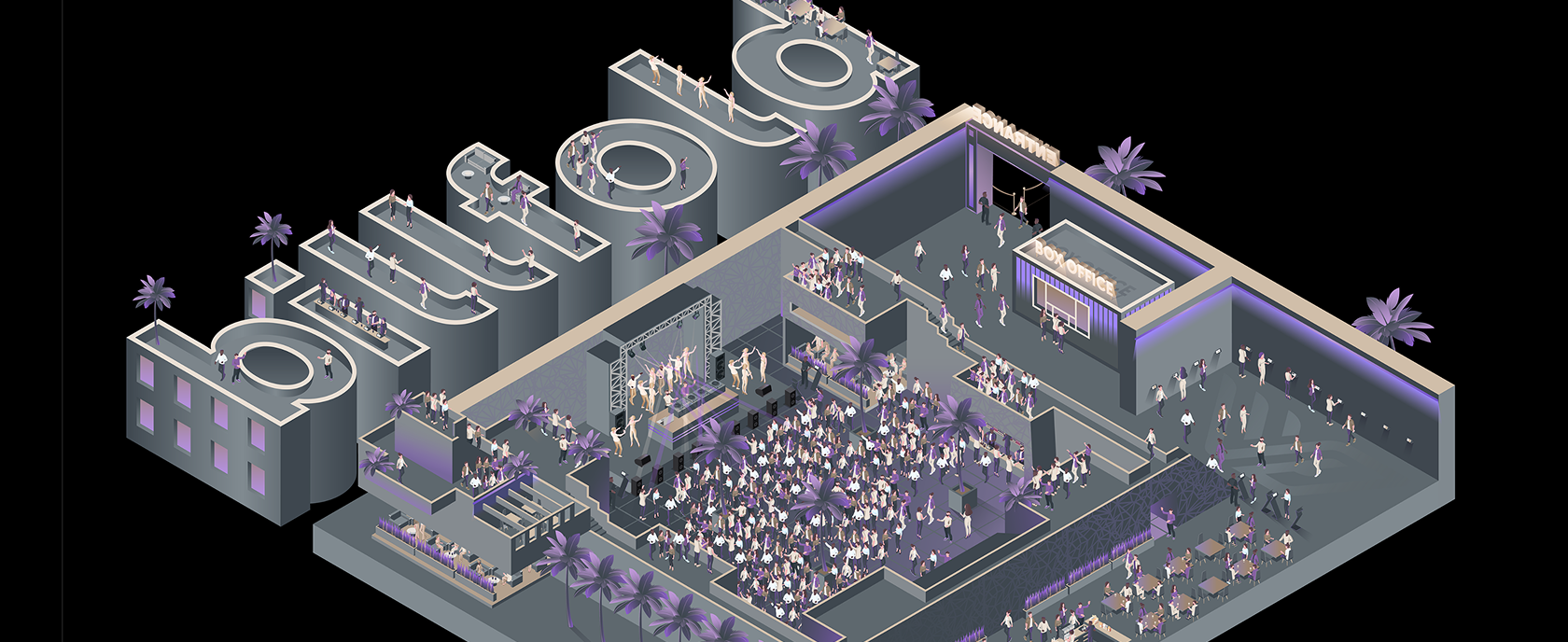
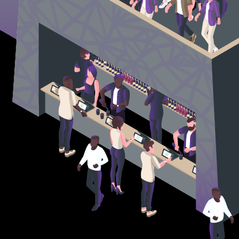
The Billfold Ecosystem
From guests trying to buy a drink, to bartenders rushing through hundreds of orders and organizers keeping the entire event under control, every part of the system had to work together in real time. The goal was to remove friction wherever it appeared.
That meant making payments effortless for guests, reducing stress and mistakes for staff, and giving organizers the visibility they never had before. By unifying these perspectives, Billfold turned a chaotic process into one seamless flow.
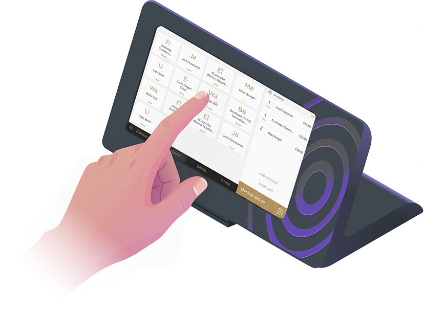
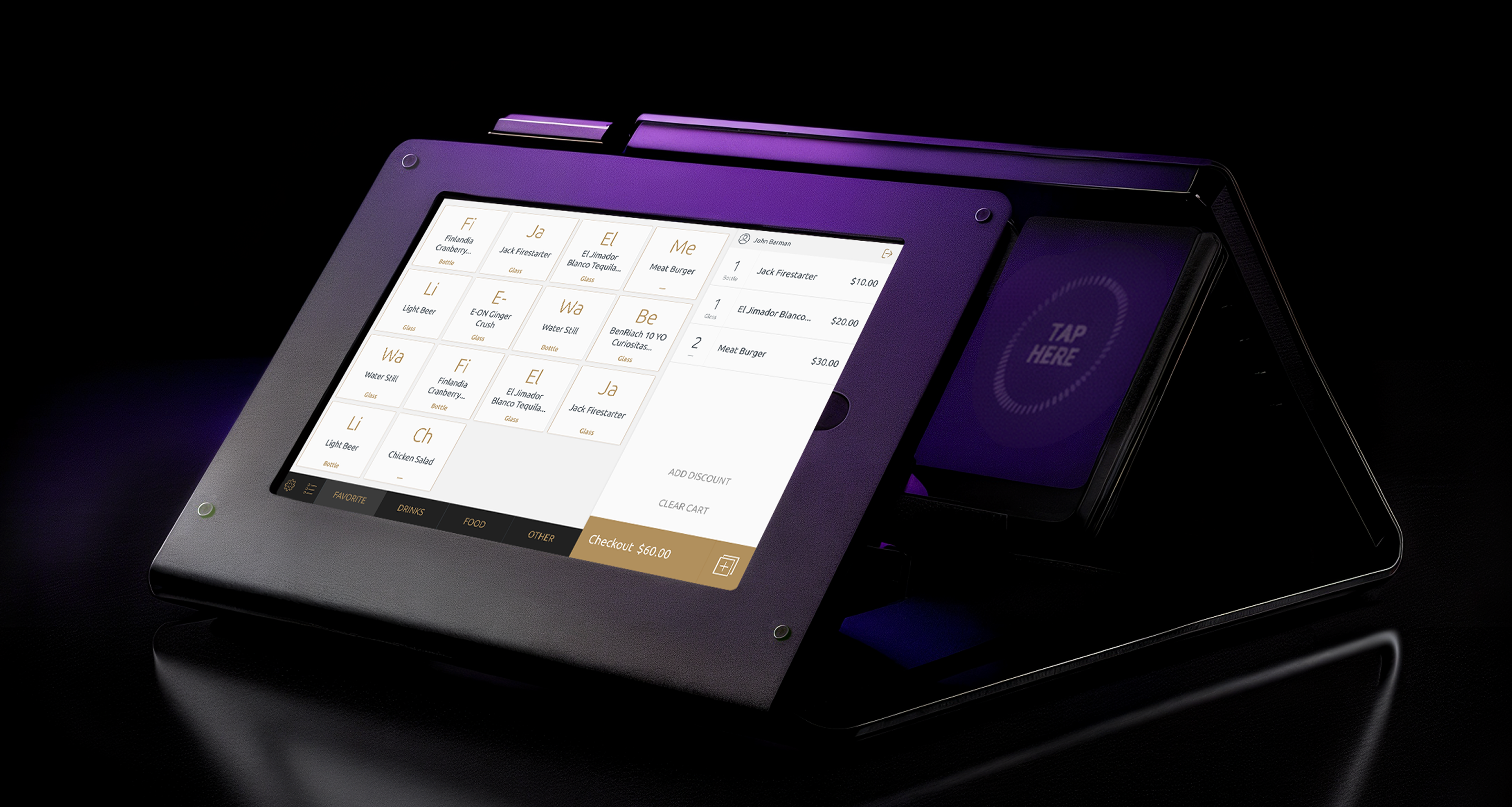
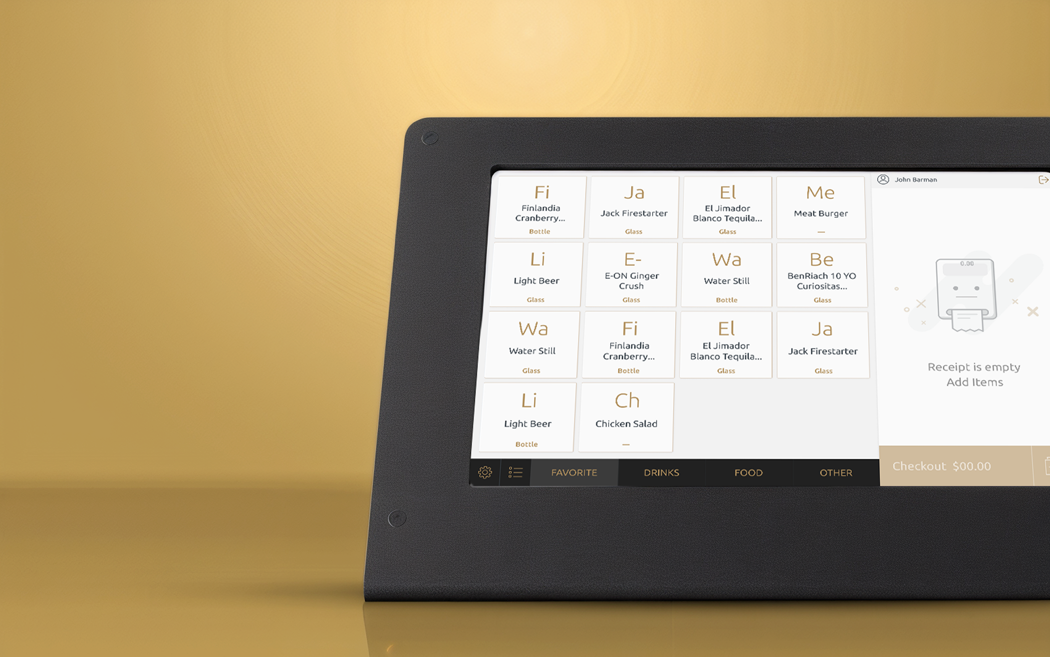
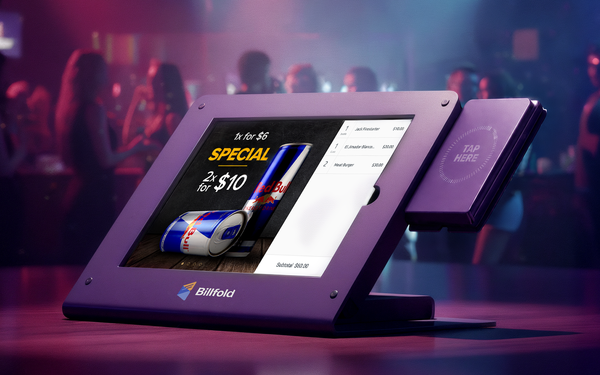
The tablet interface used by bartenders and cashiers. Designed to be ultra-fast and error-proof so staff with little training could serve hundreds of guests without slowing down.
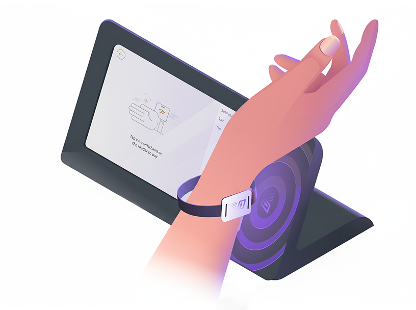
A display facing the customer that shows the order, confirms payment instantly, reduces mistakes, and gives guests confidence that every tap went through.
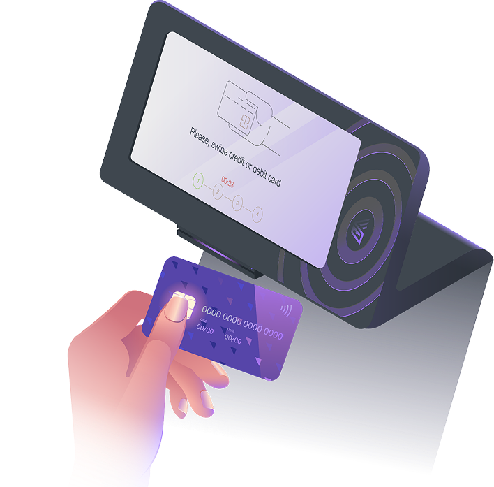
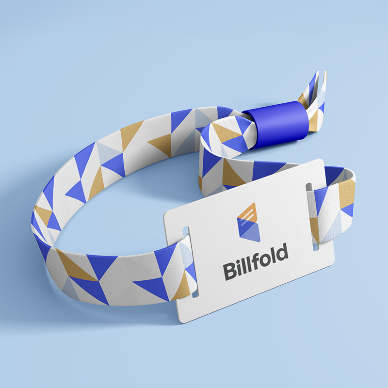
A self-service station at the entrance where guests link their bank card to an RFID wristband. This one-time setup meant no wallets or phones needed inside the event, just tap and go.
Billfold wasn't just a single tool — it became an ecosystem designed to keep festivals running smoothly for everyone involved.

The Vendor Experience
The Vendor Experience
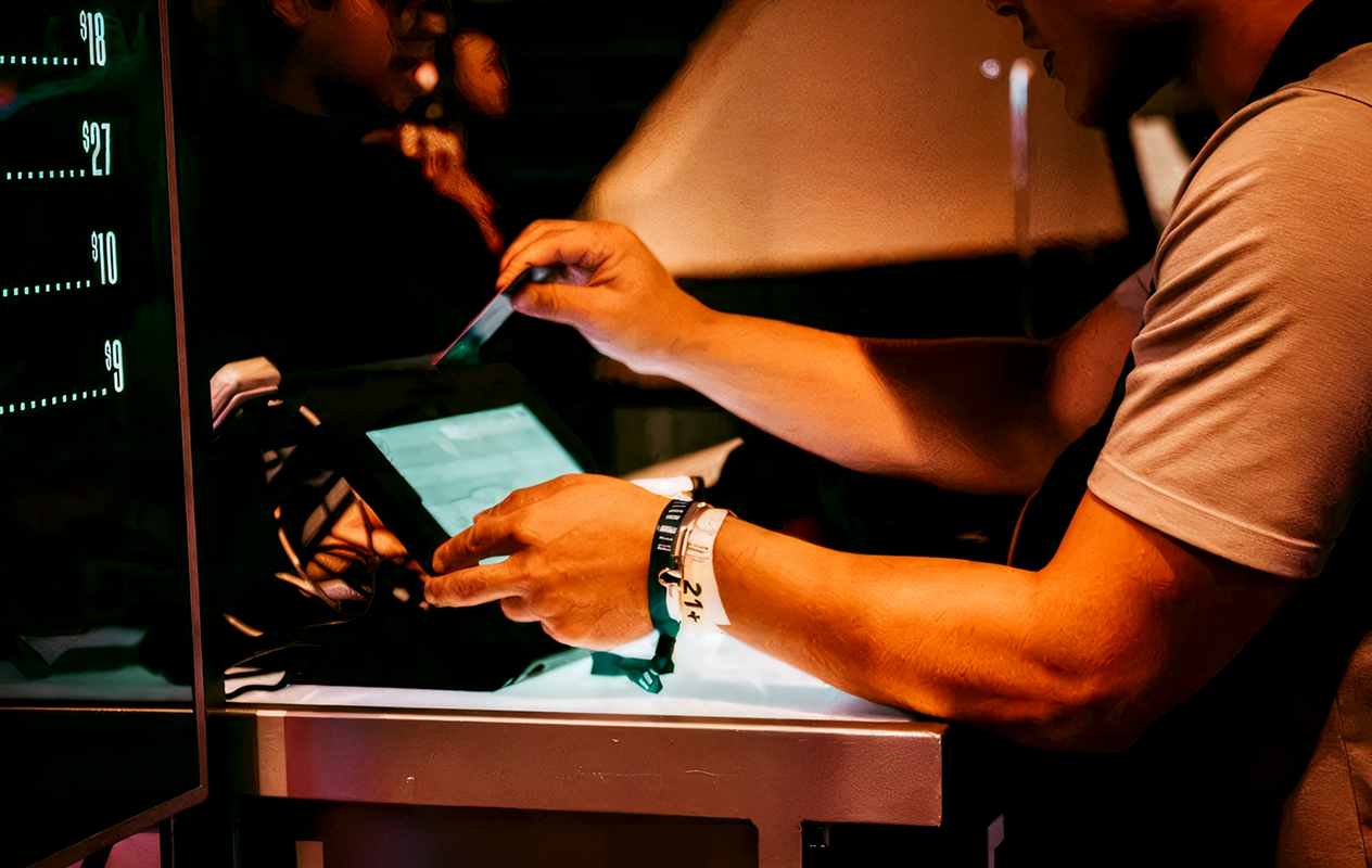
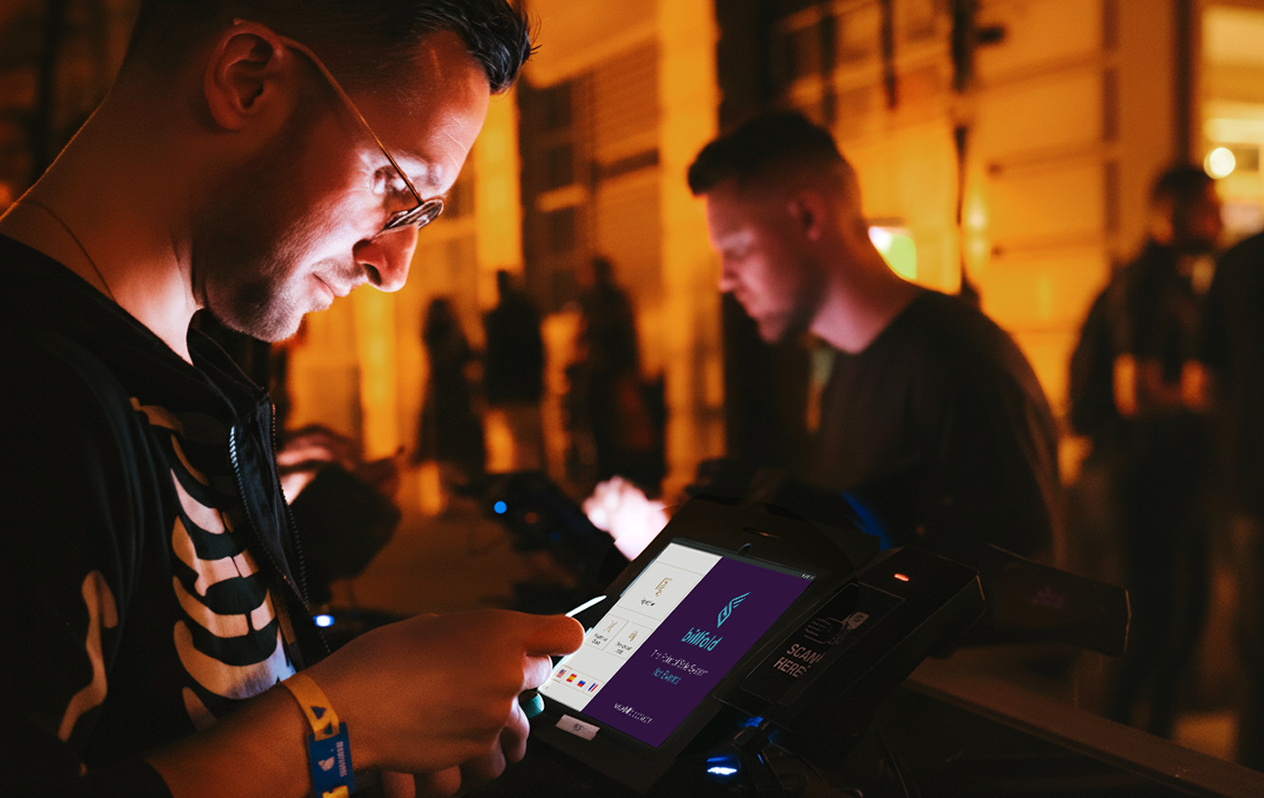
For bartenders and waiters, speed was everything.
At peak hours, a single extra tap or a confusing screen could slow the entire line and frustrate hundreds of guests. The vendor-facing POS had to be simple enough to learn in minutes and reliable enough to handle non-stop orders all night.
Designing for this reality meant focusing on clarity, error-prevention, and speed above all else. Every interaction was reduced to the essentials, giving staff confidence under pressure and keeping drinks flowing even in the busiest rush.
One screen for the vendor, one for the guest. I designed each side to show only what that person needed: no shared clutter, no accidental cross-taps, no confusion about who sees what.
Buttons sized for people working fast in loud environments. Bartenders could select items and process orders without slowing down or second-guessing the UI.
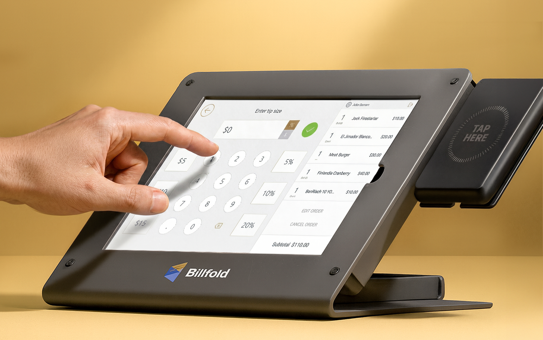
Select items. Tap to pay. No extra confirmations in the happy path. Average transaction time: under 2 seconds.
When Wi-Fi dropped, the POS kept running — caching transactions locally and syncing when connectivity returned. Staff saw a subtle status indicator but service never stopped.
Refunds and voids were accessible but required confirmation steps, reducing the risk of accidental or unauthorized use under pressure.
The Guest-Facing Screen
The Guest-Facing Screen
For guests, confidence was everything. In the middle of a noisy crowd, they needed to know their order was right and their payment went through, without second-guessing or asking staff. The customer-facing screen had to remove doubt in an environment where attention lasted only a second.
That meant showing the right information at the right time: clear totals, instant confirmation, and feedback that felt effortless. The goal was simple — make every tap trustworthy, so guests could spend less time worrying about payments and more time enjoying the event.
Each item appeared in real time as the vendor added it — e.g., "Beer ×2 – $12." Guests could see exactly what they were paying for, which cut disputes before they started.
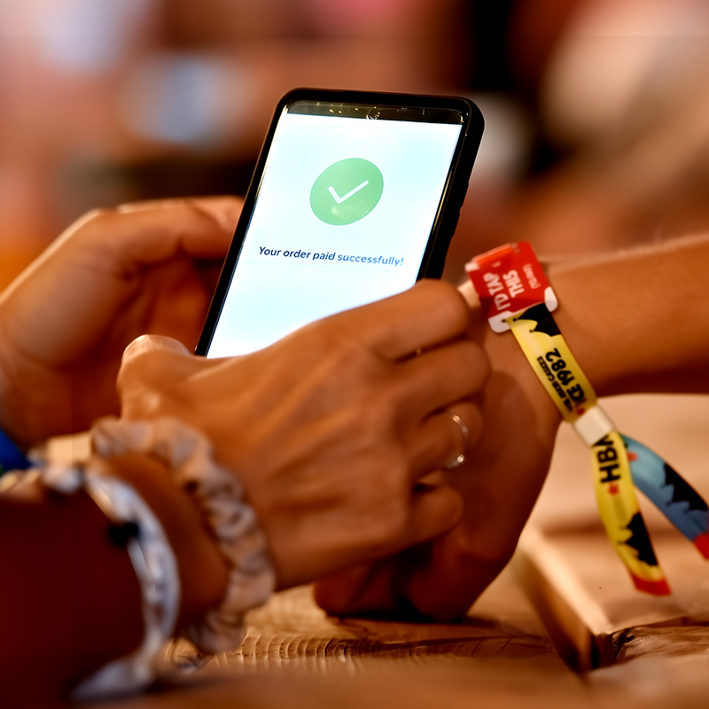
The screen showed a clean total and a single prompt: "Total $24. Tap wristband to pay." After payment, a large green checkmark confirmed it instantly — no ambiguity.
If a tap failed or a card was declined, the screen showed clear, calm feedback: "Card declined — try another card." Tone was treated as part of the UX. Embarrassment in a crowd makes things worse; the goal was to resolve the moment quietly.
During idle times, the screen could display sponsor promos or venue messages. I designed a banner area that appeared only when no transaction was in progress, and kept it visually quiet to avoid distracting from the main task flow.
After checkout, guests at select events could round up and donate spare change. Making it a single tap with no friction turned it into a surprisingly high opt-in — people at festivals, in a good mood, will give if you make it effortless.

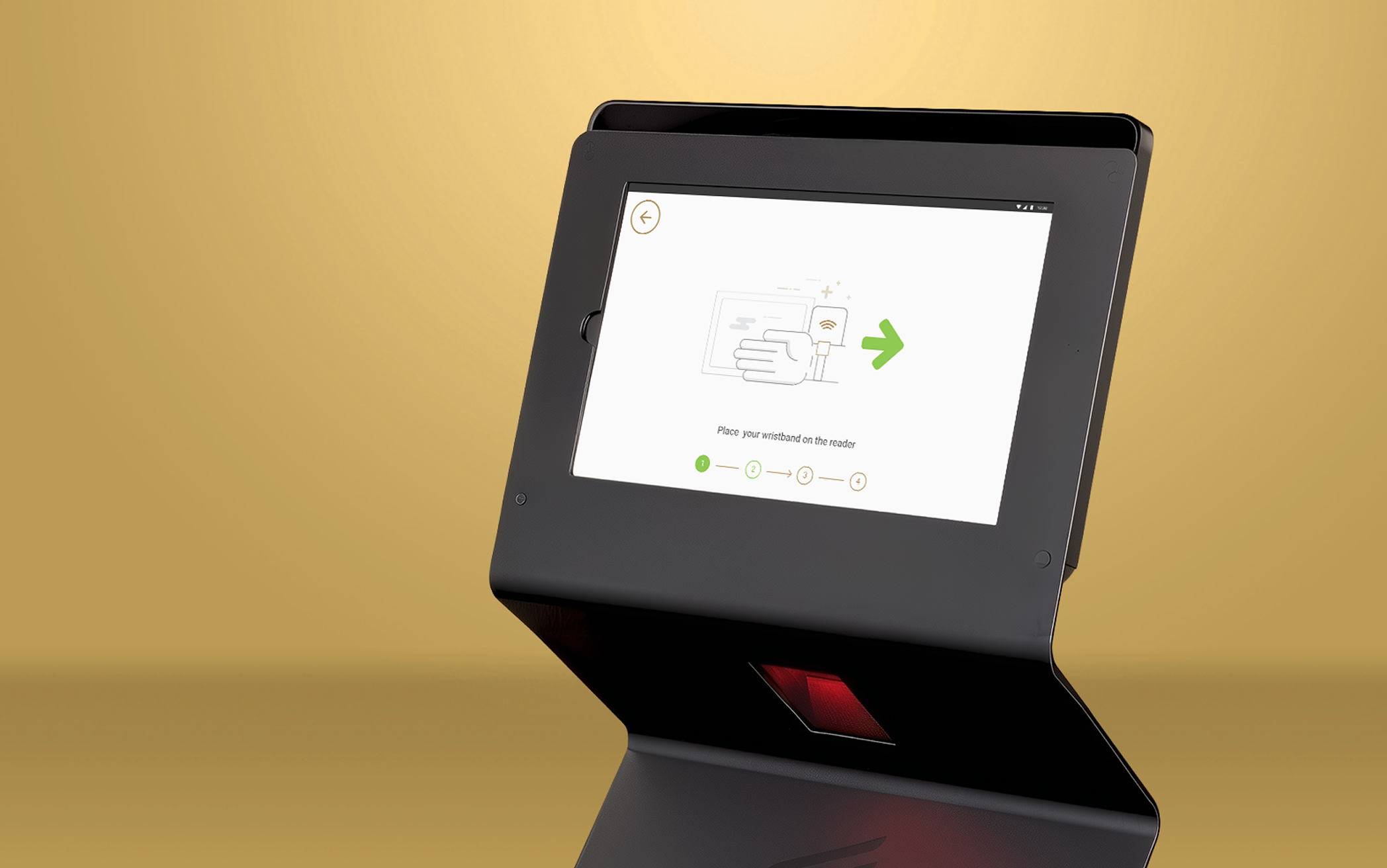
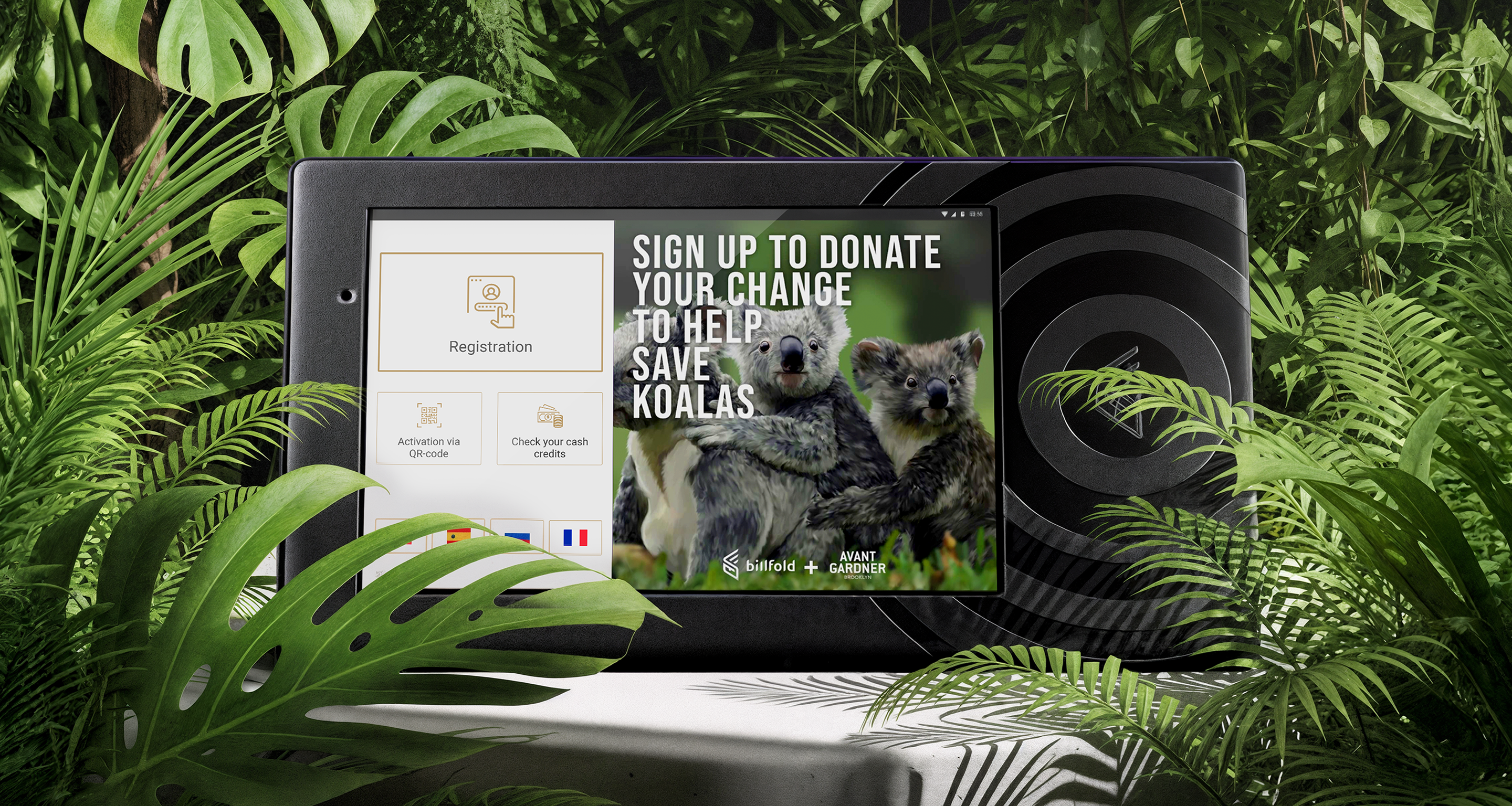
The Guest Journey: Check-In Kiosks
The Guest Journey: Check-In Kiosks
The first impression of any event happens at the gate. Guests arriving with excitement don't want to stand in another long line just to set up a wristband. The self-check-in kiosk had to make registration quick, intuitive, and foolproof, so thousands of people could flow through without bottlenecks.
The design challenge was to guide distracted guests through a one-time setup in under 20 seconds. Clear instructions, simple steps, and instant feedback made it possible. Once their card was linked to the RFID wristband, guests could put wallets and phones away and just tap to pay.
Tap wristband → swipe or insert card (or use Apple/Google Pay) → optional: enter phone/email for a receipt → done. Most guests were through in under 30 seconds.
Progress indicators ("Step 2 of 3") told guests the flow was short. Icons: a tapping wristband, a card, made each action self-explanatory. The confirmation screen told guests their wristband was now their wallet.
Kiosks had to work in direct sunlight and at night, for guests who might not speak English. Language selection was offered upfront. The UI used simple phrasing, large text, and universal icons to remove any dependence on reading.
Knowing check-in could become a bottleneck itself, we designed for multiple kiosks in parallel and roaming staff with handheld versions running identical software. My flows had to handle someone starting at a kiosk and finishing with staff assistance.

Results in the Real World
Results in the Real World
Billfold grew from a fragile prototype into the payment backbone of major festivals and stadiums, built to handle the moments when thousands of guests order at once. Even under peak demand, transactions cleared in under 2 seconds, and sales continued seamlessly through network drops thanks to offline resilience. Bartenders finally could focus on serving and guests on enjoying the night.
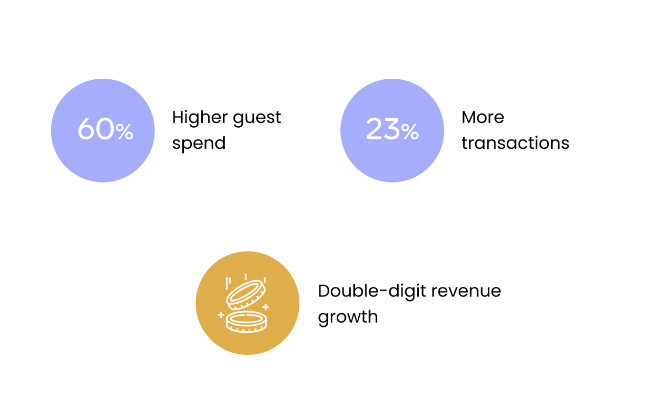
The business impact was undeniable: guests spent up to 60% more, transactions increased by 23%, and organizers reported double-digit revenue growth after switching to Billfold. Tips doubled, queues shrank, and vendors finally had a system they could trust under pressure. Today, it’s still running at large events worldwide, a direct result of design choices made to balance speed, clarity, and resilience.
Transactions that once took ~1 minute on traditional card readers dropped to under 2 seconds with RFID. At peak hours, bartenders could process more than 200 orders per hour, shrinking bar lines and keeping guests in the show instead of stuck in queues.
When payment is invisible, people spend more. Guests no longer worried about wallets, phones, or failed card swipes. Clear on-screen confirmations made every tap trustworthy. Per-person spend rose up to 60% at some venues, and RFID users spent over 2× more than card users at large festivals.
Most POS systems come with a training manual. This one didn’t need one. Staff picked it up in their first shift, and because the interface was error-proof and the flow minimal, they could run hundreds of orders confidently without slowing down or second-guessing the screen.
Staff not only served faster — they earned more. Seamless checkout made tipping effortless, and bartenders saw their tips double on average. A better UX flow had a direct impact on take-home pay.
Faster throughput, more transactions, higher per-guest spend — the combination drove up to 50% higher total revenue at major events. For organizers, switching to Billfold wasn't just a UX upgrade, it was a business decision that showed in the numbers.
When the network dropped, the POS kept running. Transactions were cached locally and synced automatically when connectivity returned — 99% offline success rate. No lost sales during failures, and real-time dashboards gave organizers visibility across every vendor the moment service resumed.

Billfold proved that when payments run smoothly, everything else follows: faster lines, calmer staff, and happier guests.
Reflections & Growth
Billfold pushed me to design for real-world chaos, not polished screens. Working remotely and solo, I had to move fast, trust my decisions, and make them work for bartenders with 30-second training and guests who barely looked at the UI.
What mattered most were the small wins: one clearer total, one fewer tap, one steadier flow, and lines shrank, staff exhaled, sales climbed. It proved to me that the best design shows its value under pressure, where clarity makes the biggest difference.
Because I couldn't be on-site, I had to adapt my research approach, relying on staff videos, real-time feedback loops, and rapid iterations with engineers in the field.
It wasn't always perfect, but it taught me to stay curious, flexible, and resourceful.
At the same time, working as the only designer in a startup pushed me to grow in resilience and autonomy: trusting my instincts, making fast decisions, and defending them to a cross-functional team that needed results, not just polished screens.
I got a crash course in designing hardware and software together, aligning screen logic with RFID behavior, and understanding how even a 1-second delay could break trust.
That experience pushed me to think less about individual screens and more about the system as a whole: how devices, flows, and infrastructure connect to shape the user experience.
I saw first-hand how UX drives business metrics.
Faster flows and clearer screens didn't just feel better, they increased revenue, enabled tens of thousands of extra transactions, and gave venues confidence in a system they could rely on.
Design wasn't decoration here, it was directly tied to dollars, scale, and trust.
When design removes friction, everyone wins: staff feel supported, guests stay engaged, and the business sees the difference in the numbers.