Turning a fragmented logistics network into a single, intelligent ecosystem.
I designed a connected service ecosystem for a transportation company — connecting 700 vehicles, 150 operators, and customers with tools that finally worked together.
Ending the era of “Let me call the driver” and “Where’s that spreadsheet?”

Overview
Gazelkin is one of the largest urban cargo transportation companies in Russia, handling thousands of deliveries every day. But while its operations scaled rapidly, its digital infrastructure didn’t. There was no single system to connect drivers, dispatchers, call centers, and customers, each relied on separate, outdated processes.
Overview
To support this growing network, I led a full UX transformation. I built an end-to-end digital ecosystem that connected every role in real time and replaced scattered tools with a single source of truth. From dispatch to delivery, information started to flow automatically — reducing coordination time, errors, and daily chaos.

I created a connected ecosystem for Gazelkin’s drivers, dispatchers, call center, and customers, powering thousands of daily deliveries with real-time visibility and seamless coordination.


The Challenge
The reality on the ground was messy. Orders lived in chats, calls, and operator memory, with no shared system or structured data. There were no user flows, no design system, and no UI foundations — everything had to be built from zero.

At the same time, the people using these tools were low-tech and under constant pressure. Drivers had zero app experience. Operators juggled calls, notes, and mental math all day. New tools couldn’t add confusion; they had to feel intuitive and trustworthy from day one.
A fragmented system with no shared data, no design foundation, and users under constant pressure, this was the real challenge.
My Part in This
I worked across every part of the system: from the driver app to the customer site. To understand what really needed fixing, I spent time with drivers, operators, and dispatchers, watching how they worked and where things broke down.
It wasn’t just about making screens look better, it was about creating tools people actually wanted to use, even if they didn’t trust tech to begin with.
Before touching a wireframe, I rode with drivers on full shifts, sat with dispatchers during peak hours, and watched operators manage chaos through phone calls and memory. The research shaped everything.
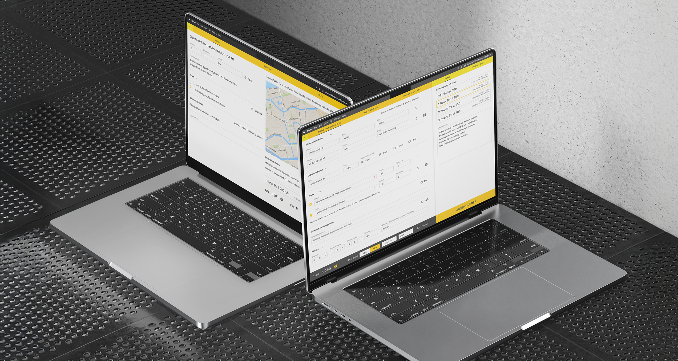
I designed across all user-facing products — driver app, dispatcher dashboard, call center interface, and customer-facing site — maintaining a single coherent vision across all of them.
There were no flows, no design system, no UI foundations when I arrived. I built everything from scratch, making decisions that had to scale across four very different user groups.
Coordinated with external designers and photographers to align visual language across internal tools and the customer brand — so the system felt coherent end to end.
Stayed close to leadership throughout, framing design decisions in operational and business terms. The goal wasn’t just better UX — it was measurable improvement in how the company functioned.
Research & Discovery
To design tools that worked in real operational chaos, I had to understand how Gazelkin’s logistics actually functioned day to day. I started by mapping existing workflows, sitting with drivers, operators, and dispatchers, and observing how information moved through chats, calls, and mental shortcuts.
Alongside on-site observations, I conducted stakeholder interviews, desk research, and process audits to understand the company’s scaling challenges. By combining what people said with what they actually did, I identified critical pain points, defined key user groups, and set the direction for a whole system.
I spent time on-site with drivers, dispatchers, and call center operators during real shifts. This revealed the messy reality behind deliveries: orders were passed through personal chats, calls, and memory; drivers relied on verbal updates; and operators mentally tracked routes. These sessions exposed the biggest coordination gaps and the pressure under which people worked.
I interviewed leadership, logistics managers, and key operators to understand business priorities and where existing processes broke down. These conversations clarified which issues were operational vs. UX, and which parts of the workflow could be standardized without disrupting the culture.
I analyzed internal documents, spreadsheets, and historical delivery data. Mapping communication flows highlighted where information was duplicated, lost, or delayed. I also reviewed existing tools to understand their limitations and how they contributed to errors and bottlenecks.
I clustered users into four distinct groups -- drivers, dispatchers, call center operators, and customers -- each with different tech literacy, responsibilities, and pressures. This segmentation informed information architecture, feature prioritization, and UI decisions for each role.
I synthesized insights into clear UX problems: fragmented information flow, lack of real-time feedback, no shared source of truth, and a high cognitive load on users. This framework became the foundation for the product strategy and guided all subsequent design decisions.

Quick note before we start…
This case study covers the driver app and call center interface, but represents just part of a larger transformation. In parallel, I also led the redesign of the customer-facing website and mobile app, making it easier for people to book services, track deliveries, and get help without calling support.
I also collaborated with developers on refining the internal logistics tool, improving task visibility, fixing major UX blockers, and helping dispatchers work with less chaos. I’m still organizing those flows, decisions, and results, and will be updating this case study soon with the full story.
Understanding the Users
The real insights didn’t come from surveys, they came from sitting in the call center at rush hour and riding along with drivers. I watched operators manage a city’s worth of deliveries through chat groups and memory. I saw drivers scribbling notes, calling in for updates, hoping nothing changed mid-route.
These weren’t abstract “user groups”, they were people holding a complex system together through sheer effort. What I saw in the field shaped every decision. My job was to turn that invisible work into clear, reliable tools, so every feature solved a real problem I’d seen myself.

Information gaps and low digital literacy made every delivery a guessing game. Drivers relied on calls, notes, and memory to navigate their day — missing updates, making errors, and working without visibility into what came next.
Shadowing 6 drivers during complete shifts
Informal conversations during breaks to gather honest input
Documented delivery flow from task assignment to completion
Captured real challenges like weak mobile coverage, noisy environments, and difficulty accessing information while driving
Identified friction moments causing delays and miscommunication
Drivers received delivery information as unstructured text messages from multiple operators and logistics team members. No standardization, no confirmations, massive room for error. Critical details were missed, misread, or buried in chat history -- especially problematic with 6-8 jobs per day.
Most drivers wrote addresses by hand and memorized routes. Changes or cancellations often got lost mid-route, leading to missed or duplicated jobs.
Many had never used work-related apps. They were worried about crashing phones, complex interfaces, small buttons. Simplicity wasn't nice-to-have -- it was essential for adoption.
They didn't want options or multitasking features. They needed to know: what's next, how to get there, and how to mark it complete.
When internal miscommunication led to delays or wrong addresses, drivers faced angry customers despite having no control over the root cause.

Every delivery passed through their heads. Operators were bombarded with calls and messages, constantly interrupted, and forced to keep the entire operation in their memory, without any shared system to lean on.
During live customer calls and order processing
Answered 10+ real customer calls to experience pressure
Documented full order flow from initial call to job confirmation
To test pricing logic, timing conflicts, and promo handling
With operators to surface common issues and workarounds
Operators weren't just taking orders--they were handling confused customers, chasing driver updates, and translating between broken systems.
Operators rarely finished a single task without being interrupted by drivers, customers, or managers. Their day was a nonstop stream of incoming calls, messages, and problems that had to be resolved immediately.
Delays, wrong addresses, or unclear job details caused by dispatch or drivers became the operator’s problem -- and their calls often turned into long and difficult support conversations.
They relied on chat groups, calls, and personal notes. Job details were fragmented, updates were inconsistent, and mistakes were hard to track back to their source.
Each operator carried a full mental model of who was where and which jobs were active. If someone stepped away, no one else had the full picture -- the “system” existed only in their heads.
Without a dashboard or shared overview, operators couldn’t anticipate issues or plan proactively. They were stuck reacting to problems as they emerged, often under time pressure.
“I do six or seven jobs a day. If I miss something, it’s my fault, even if no one told me about the change. The customer doesn’t care where the mistake happened, they blame me.”

Designing for the Road, Not the Office
Designing for the Road, Not the Office
The driver interface wasn’t designed in a vacuum, it was shaped by real routes, real constraints, and the daily rhythm of delivery work. Each feature had a clear purpose: reduce confusion, save time, and build trust. The focus was on practical solutions that fit into how drivers actually worked, not how we wished they did.
Each decision addressed a specific pain point, from missed updates to unclear job details and constant back-and-forth with dispatch. Together, these changes turned a messy process into a structured, reliable tool.
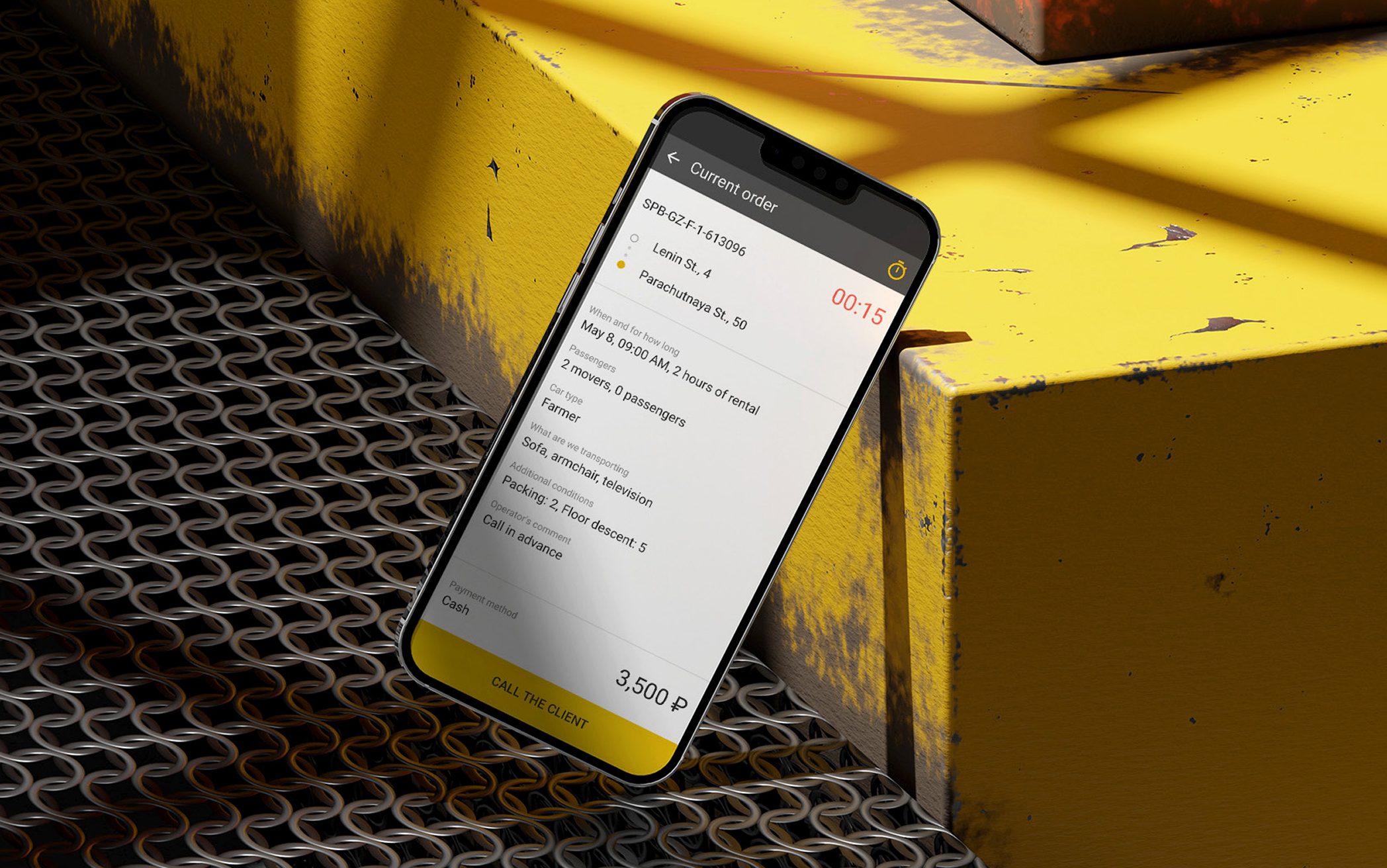
A time-ordered, color-coded job list cut through the noise, reducing cognitive load and making the next step instantly clear.
All key details -- location, weight, loading requirements, floor access, special notes -- were displayed upfront. No more scrolling through chats to find critical information.
Drivers could browse and accept jobs directly in the app instead of waiting for dispatch. This gave them more control over their day and reduced unnecessary back-and-forth.
Built-in delay reporting, quick questions, and client messaging replaced random calls and scattered updates, creating a clear, trackable flow of information.
Drivers could upload photos for proof, incidents, and paperwork directly through the app -- making reporting fast, reliable, and centralized.
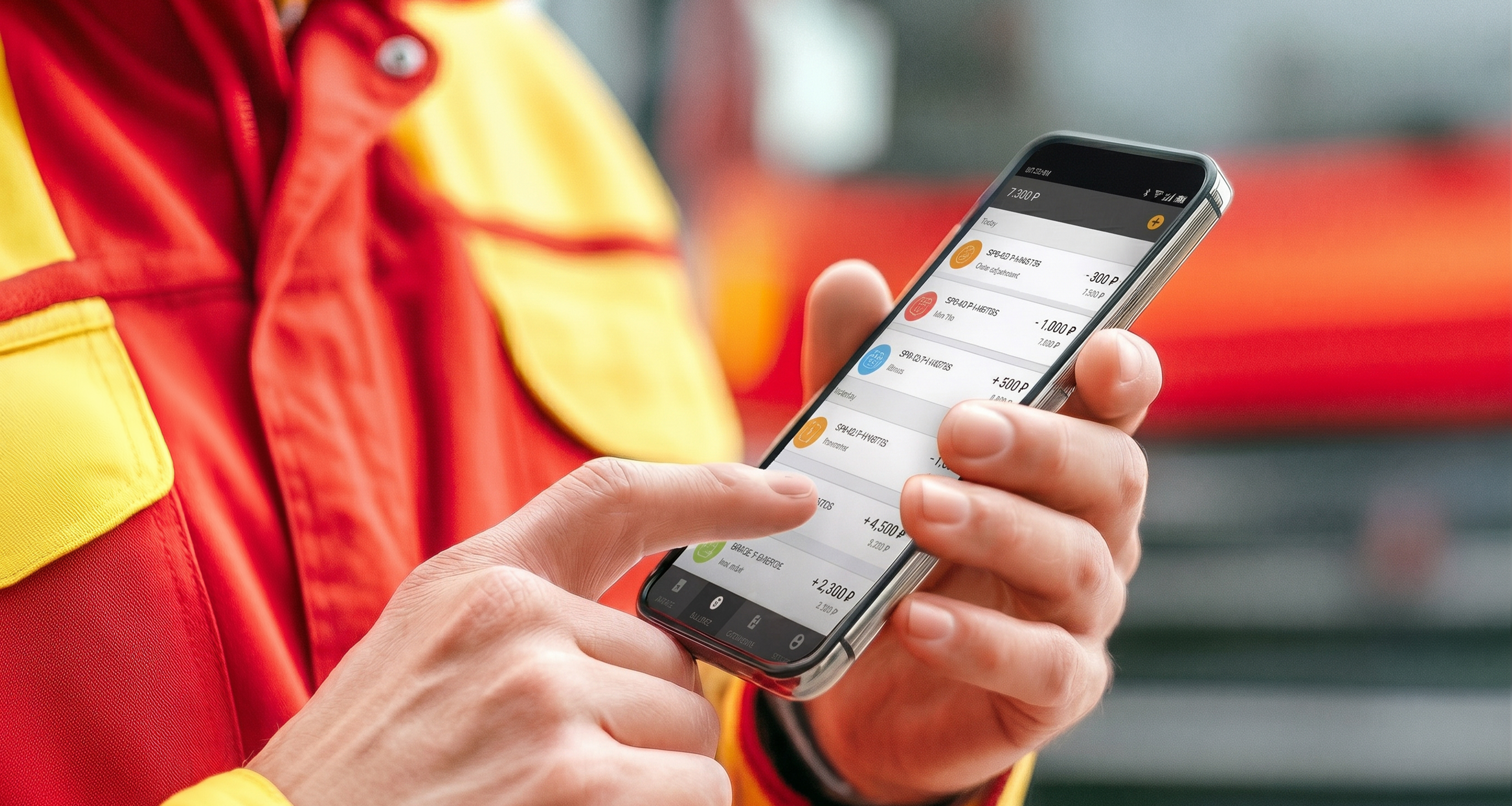
A real-time breakdown of payouts, bonuses, and adjustments built trust through clarity, with color-coded explanations for every line item.
The app worked seamlessly without signal, with SMS backup for critical updates, ensuring reliability on the road.

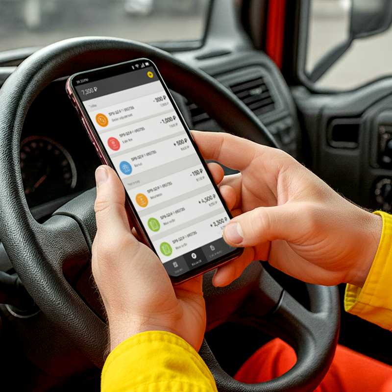
Drivers adopted the app immediately, without training, and quickly embraced it as something that made their days easier.
Even though the driver app solved the core problems, I often think about what I’d improve if I were designing it today.
With more time and resources, there are features that could make the experience even clearer, safer, and more motivating for drivers.
Icons showing stairs, heavy loads, long-distance, or time-sensitive jobs, visible before accepting. Drivers make better decisions, fewer surprises mid-delivery.
All jobs plotted on a single map with estimated distance, order, and time. Reduces the mental load of planning a shift.
Quick issue flag after each delivery: wrong address, customer absent, access problem. Gives dispatch real-time signal without requiring a call.
Weekly job count, on-time rate, bonus progress. Not surveillance — transparency. Drivers want to know where they stand.
Built-in form to contest a deduction, with reason and supporting photo. Removes a major source of distrust between drivers and the company.
One tap to alert dispatch in an unsafe or urgent situation. Simple, essential, and the kind of thing that builds genuine trust in the tool.
Drivers adopted the app immediately, without training, and quickly embraced it as something that made their days easier.
Optimizing the Operator Experience
Optimizing the Operator Experience
Operators were the ones holding everything together. They worked through calls, chats, and sheer memory to keep deliveries moving, making quick decisions without the tools to support them. It was fast, messy, and exhausting — but they made it work.
My goal was to take that invisible, improvised process and turn it into a clear, structured flow. Instead of juggling a dozen tabs and phone calls, operators now had one place that guided their actions, reduced mental load, and gave them confidence.
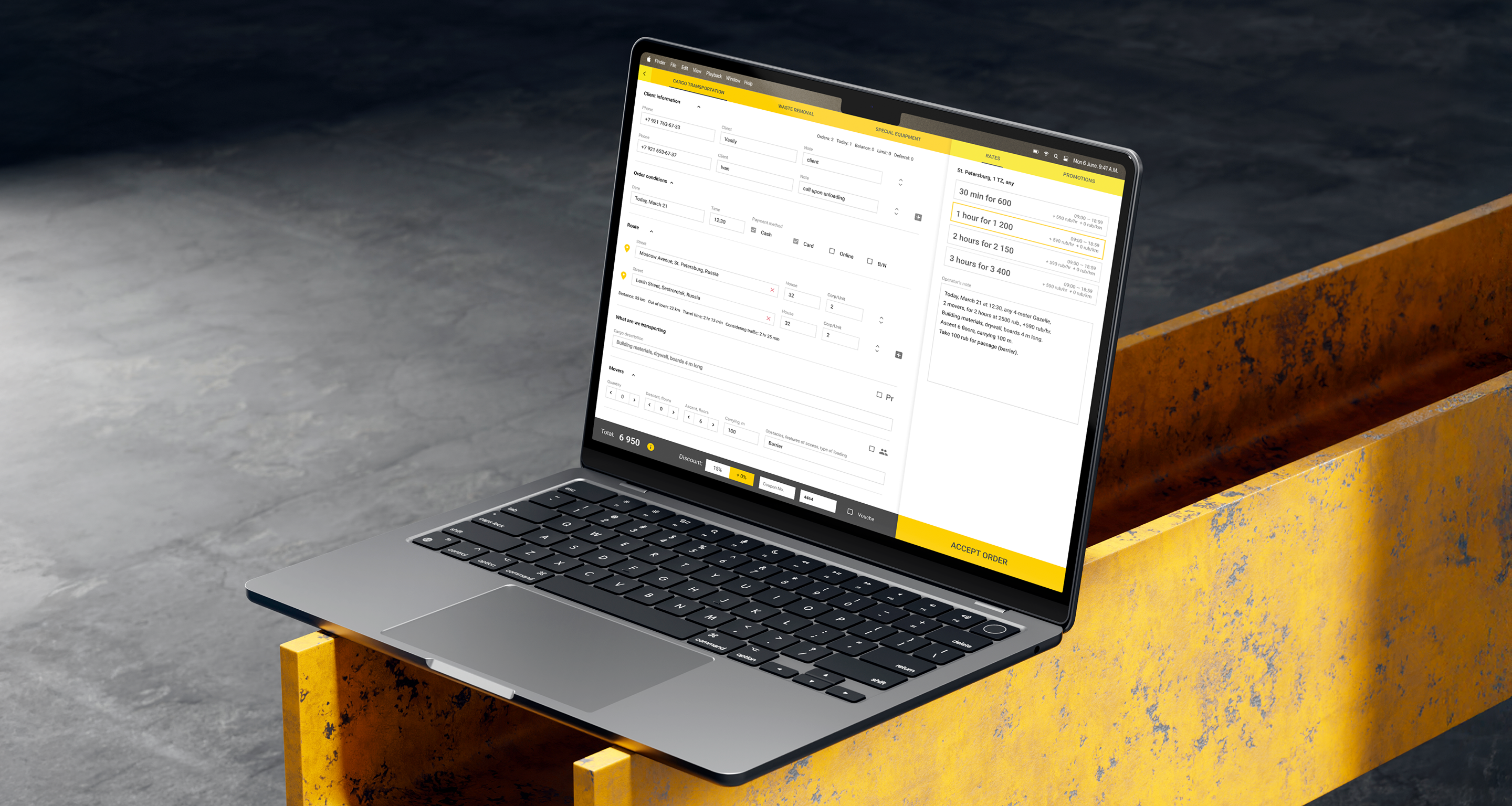
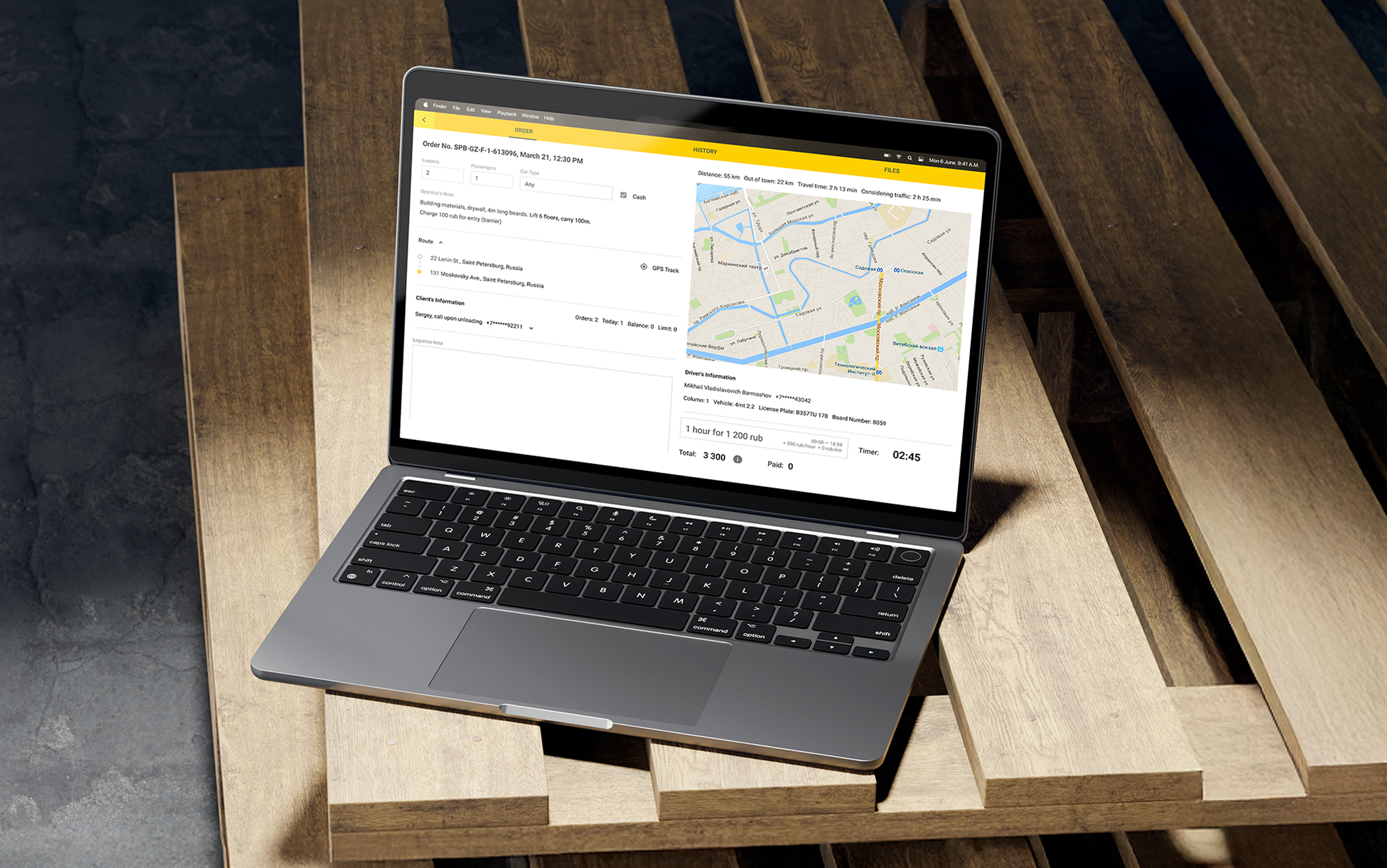
A single interface for creating any order type, with all required fields and contextual details in one place. This transformed order-taking from stressful improvisation into a guided process.
Prices updated in real time as operators added addresses, timing, and service details--removing guesswork and reducing callbacks for clarifications.
Context-aware prompts displayed available discounts, policy reminders, and relevant suggestions based on order details, helping operators work faster and more confidently.
Floor numbers, heavy item flags, and access requirements were embedded directly into each job specification, ensuring drivers had complete context from the start.
Operators could record entry codes, gate info, and delivery instructions like “call on arrival” directly in the order--no more relying on scattered chat messages.
Coupons and manual adjustments were applied instantly, with the final total confirmed in real time, giving both operators and customers immediate clarity.

Operators could finally focus on resolving real issues rather than relaying information.
I’m proud of how much the tools improved operators’ daily work, giving structure to what used to be improvised under pressure.
But with distance, I can see new opportunities to push the experience even further.
Quick view of past orders, preferences, and notes before the call even starts -- no more starting from scratch with repeat customers.
AI-powered recommendations for discounts or upsells based on order details, location, and customer history.
Live view of driver locations and availability so operators can give accurate time estimates instead of guessing.
Fast way to tag calls as “difficult customer,” “pricing complaint,” or “service issue” to improve operations over time.
A simple daily mood tracker to help management identify when operators need support or breaks.
Operators could finally focus on resolving real issues rather than relaying information.
Results for Drivers: Less Chaos, More Delivery
Results for Drivers: Less Chaos, More Delivery
As soon as the app made it into drivers’ hands, it began to resolve real pain points, and the impact was evident on day one. Drivers no longer had to rely on constant calls or vague instructions: essential info and updates became available at their fingertips.
Because drivers got clearer workflows, transparent earnings, and better feedback loops, miscommunications dropped, productivity rose, and trust in the system increased. Over just a few weeks, the data showed that the new solution wasn’t just nice to have — it made their work measurably easier and more reliable.
Thanks to integrated job status updates, automatic route changes, and clear instructions in the app, drivers no longer needed to phone dispatch for clarifications. Daily “check-in” calls dropped dramatically, freeing up dispatcher and driver time alike.
Most drivers, even those less tech-savvy, began relying on the app for daily operations after a short adjustment. The interface was intuitive, and lightweight onboarding nudges helped embed usage quickly into daily routine.
With real-time tracking, clearer job details, and timely notifications for delays, drivers made fewer mistakes or missed stops. Route adherence improved and time buffers were respected more consistently.
Because drivers spent less time in coordination overhead (calls, clarifications, waiting), they could allocate more actual delivery time. This resulted in a boost in completed assignments per shift.
Improved scheduling visibility and dynamic adjustments (e.g. via traffic-aware reroutes) enabled drivers to hit scheduled windows more reliably.
In feedback sessions and surveys, drivers reported feeling more confident, less “on call,” and better informed. Many commented that the app reduced stress around unexpected updates and eliminated constant back-and-forth with dispatch.
Clearer instructions, fewer miscommunications, and reduced blame for systemic issues made daily work less stressful.
Photo proof, visible earnings, and clear issue tracking gave drivers more control and reduced disputes.

“Feels good not having to stop and call someone for every little thing.”
Results for Operators: Calm in the Control Room
Results for Operators: Calm in the Control Room
Before the redesign, operators were buried under repetitive calls, manual order tracking, and constant stress from unpredictable schedules. Every day felt like firefighting — answering the same questions, updating spreadsheets, and managing chaos instead of operations.
With the new dashboard, daily workflows became structured and transparent. Real-time driver statuses, instant alerts, and automated route updates turned routine control into proactive management.
Previously, operators manually calculated prices during calls, often leading to inconsistencies and customer complaints. Automated pricing and structured inputs removed guesswork, ensuring accuracy and consistency across every order.
Operators could now quote, confirm, and dispatch in a single conversation instead of two or three. Real-time order updates and synced data meant fewer “let me check and call you back” moments -- saving time and improving client trust.
Even operators with low tech literacy quickly embraced the new system. The intuitive interface, guided prompts, and clean layout made it easy to learn -- no training sessions or manuals required.
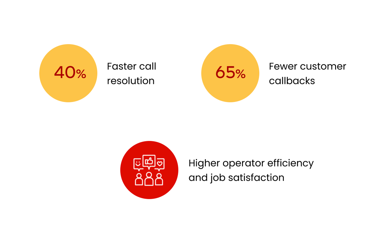
With all order data in one interface, the average call time dropped from 4.2 to 2.5 minutes. No more switching between spreadsheets, chats, and maps -- operators could resolve most requests during the first call.
Centralized visibility of routes, drivers, and delivery progress replaced manual tracking and endless messaging. This integration saved hours per shift and improved responsiveness during peak periods.
Automatic synchronization between driver and operator views eliminated duplicated entries and miscommunication. The system ensured every delivery status change -- delay, cancellation, or reassignment -- was instantly visible on both sides.
Clients received faster answers, more consistent pricing, and fewer callbacks. The streamlined workflow reinforced reliability and boosted satisfaction across the entire delivery process.
Built-in prompts, automation, and transparency turned reactive chaos into structured work. Operators described shifts as calmer and more predictable, with reduced overtime and a stronger sense of control.
All delivery data, route metrics, and performance reports were centralized, giving logistics managers and analysts access to live information. This alignment eliminated communication bottlenecks and made coordination effortless across the company.

“We used to get so many complaints because the prices didn’t match or orders got mixed up. Now everything’s clear, and the calls go smoother.”
Business Impact
The redesign turned Gazelkin into a unified, data-driven logistics ecosystem. Real-time synchronization across driver, operator, dispatcher, and customer tools made operations faster, communication seamless, and data transparent.
Automation reduced manual work, improved accuracy, and enabled smarter, scalable growth. The new connected system strengthened efficiency, customer trust, and brand consistency across every touchpoint.
The new call center dashboard reduced order entry time by 40 % and eliminated manual pricing errors. Structured fields and automated validation minimized operator workload and ensured every quote matched system rules.
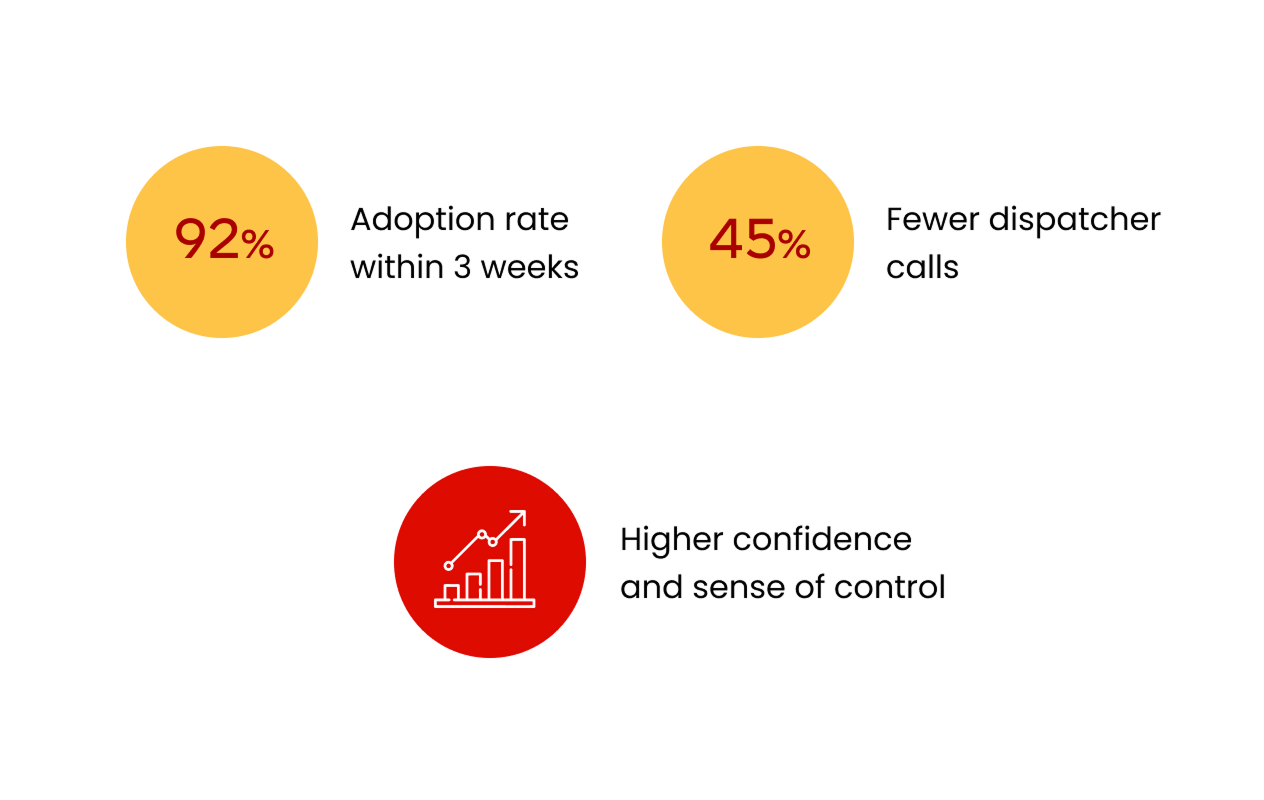
Real-time monitoring and shared dashboards cut dispatcher-driver calls by 45 % and eliminated reliance on phone confirmations. The entire workflow became visible and traceable -- from booking to delivery.
Seamless information flow between all tools reduced delivery errors by 70% and eliminated data silos. Every department -- from call center to logistics -- now works with a single source of truth.
92 % of drivers adopted the new app within three weeks, and operators reached 100 % adoption on day one. Even users with low technical literacy found the tools intuitive, reducing the need for training or onboarding support.
Automation of pricing, order confirmation, and route updates reduced manual workload across departments. Teams processed more orders per shift with fewer mistakes and less stress.
Faster order handling and consistent communication significantly decreased callbacks and complaints. Customers now experience a seamless journey -- from quote to delivery confirmation -- which strengthened trust and repeat business.
Despite legacy constraints, the redesign aligned internal tools and the customer-facing website under a unified visual language. This created a cohesive experience that made the brand feel more modern, professional, and reliable.
The new dispatcher and analytics dashboards gave management full visibility into operational KPIs. Real-time insights on delivery performance and customer feedback now inform business planning instead of assumptions.
The new modular architecture allows for future scaling, integrations, and automation. Gazelkin’s digital transformation turned its logistics operations into a connected product ecosystem ready for further innovation.
Reflections & Learnings
Reflections & Learnings
Leading UX across four interconnected products meant constantly translating between business goals, operational realities and user behavior. It showed how empathy and systems thinking together can rebuild clarity in complex, fast-moving environments.
This project reshaped how I approach complex product ecosystems. It showed that true UX impact comes from operational alignment, when design not only enhances usability but also strengthens internal processes, decision-making, and measurable business outcomes.
Spending time with drivers and operators in real environments revealed things no survey could reach. Watching people adapt under pressure exposed invisible workflow gaps — and grounded every design decision in actual behaviour, not assumptions.
Designing for four interconnected user roles forced me to think in dependencies. A decision in the driver app rippled into the dispatcher dashboard. I stopped thinking in screens and started thinking in ecosystems.
Leading UX across all platforms gave me end-to-end visibility and the ability to connect product decisions directly to business goals. Consistency across tools isn’t just aesthetic — it reduces friction, speeds up delivery, and makes design maintainable.
Legacy technology, low-tech users, and hard deadlines meant there was no room for decoration. Every decision had to be functional first. That pressure produced better, more focused work than unconstrained ideation ever would.
Embedding UX into operational processes — pricing accuracy, order flow, real-time coordination — turned design into something leadership could measure. I learned to speak in the metrics that matter: efficiency, accuracy, and trust.
Managing multiple teams, timelines, and constraints taught me that communication and clarity beat pixel precision every time. The best design decision is often the one the team can actually build and maintain.
When design supports how decisions are made and how teams work day to day, it becomes a force that drives the business, not just a layer that makes it look better.
What I learned the hard way
This project taught me one of the toughest lessons in my career, that even the most thoughtful, well-tested design can’t survive when the business behind it is unstable. The UX worked, the data proved it, and people loved using the tools. But when internal processes, incentives, and leadership alignment start to collapse, even great design can’t hold everything together.
It’s a hard truth that changed how I think about impact. I realized that sustainable design isn’t just about what users do, it’s about what the organization is capable of maintaining. The full story is something I usually share in person, but it shaped how I now approach every project: with equal attention to systems, people, and the business reality around them.